The creative and technical journey of Smashy Design’s new website
After months of planning and design exploration, we’re excited to share the story behind our website revamp! This journey combined cutting-edge web development with a fresh visual style to create a seamless, fast-loading experience.
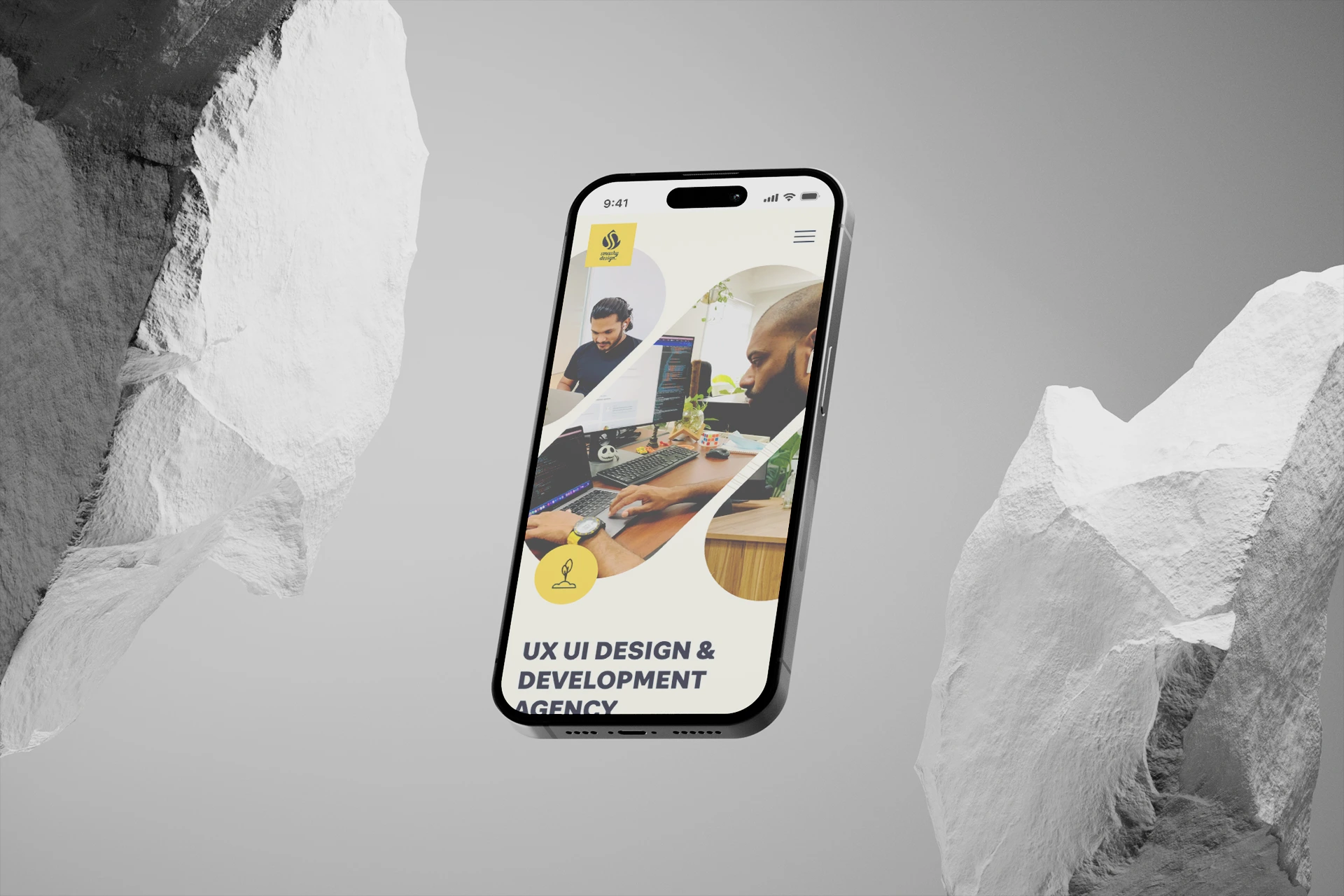
What we had before
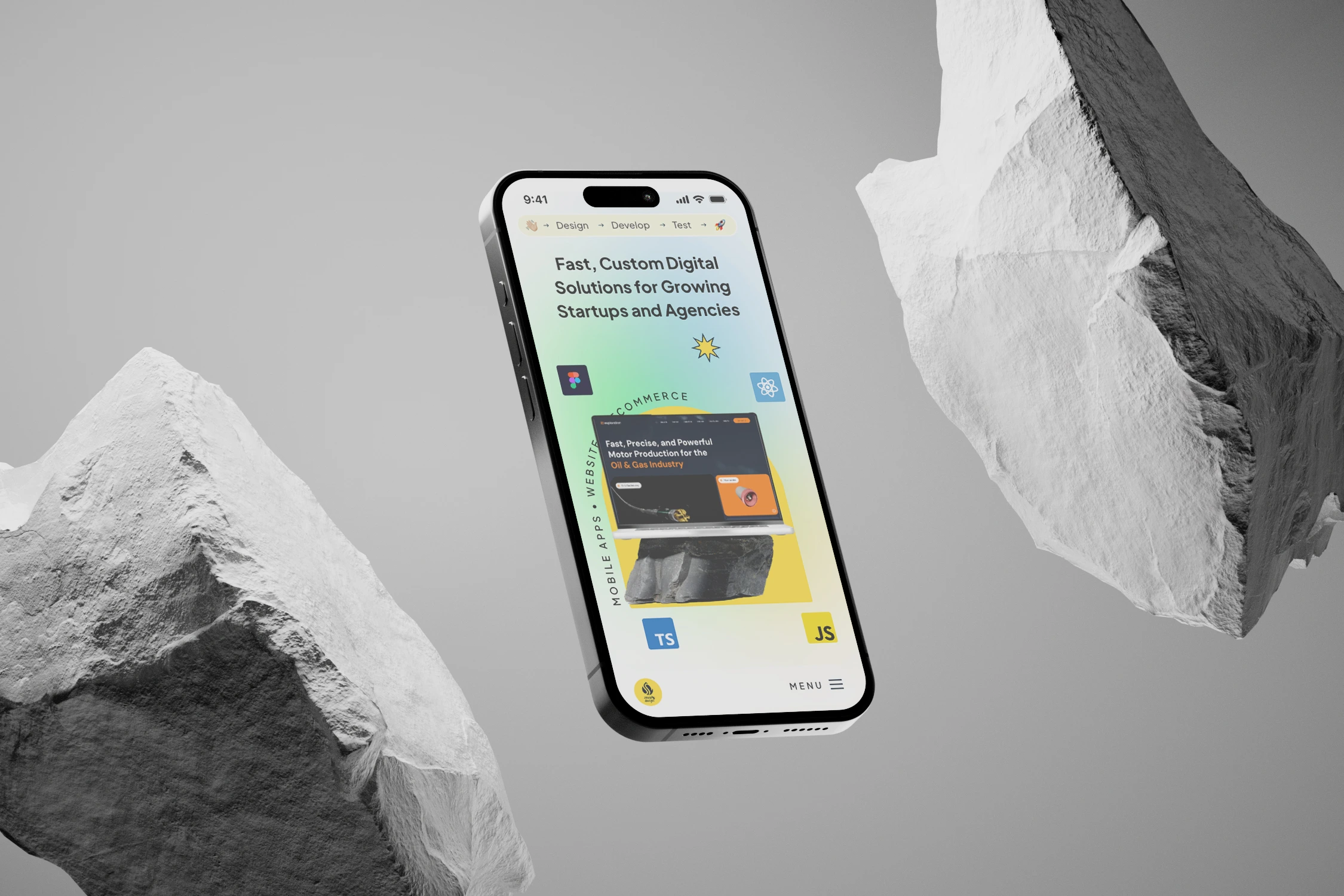
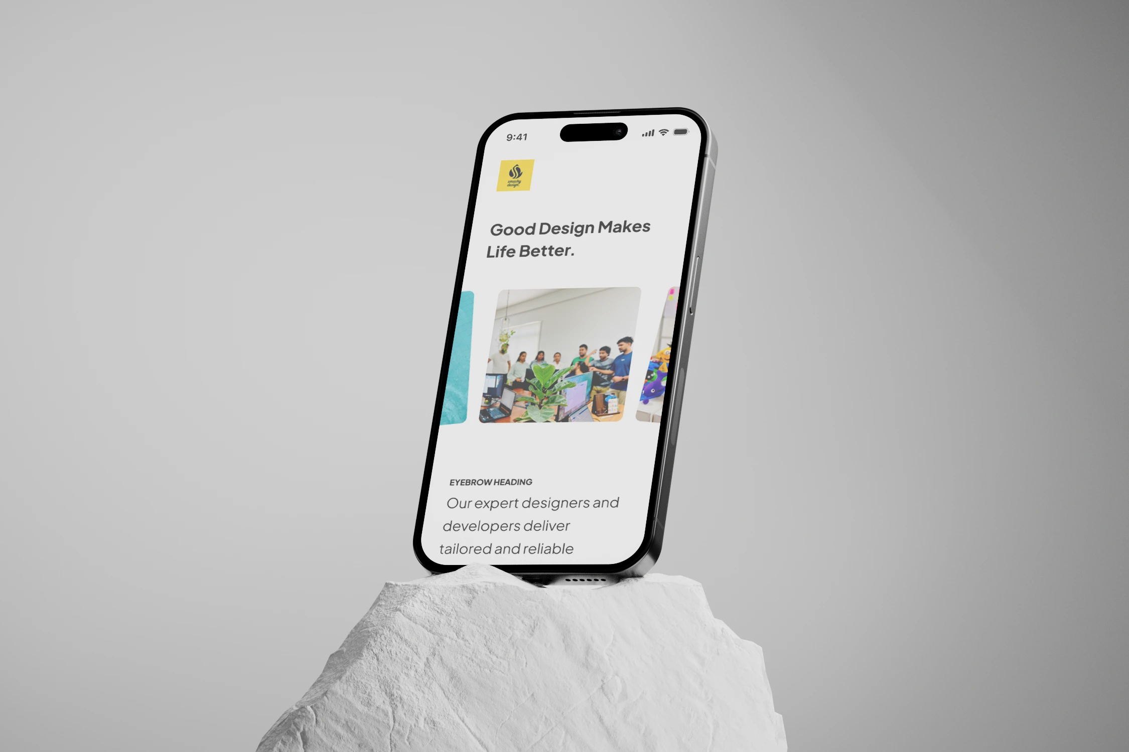
Converted into this fresh look
Crafting the Blueprint
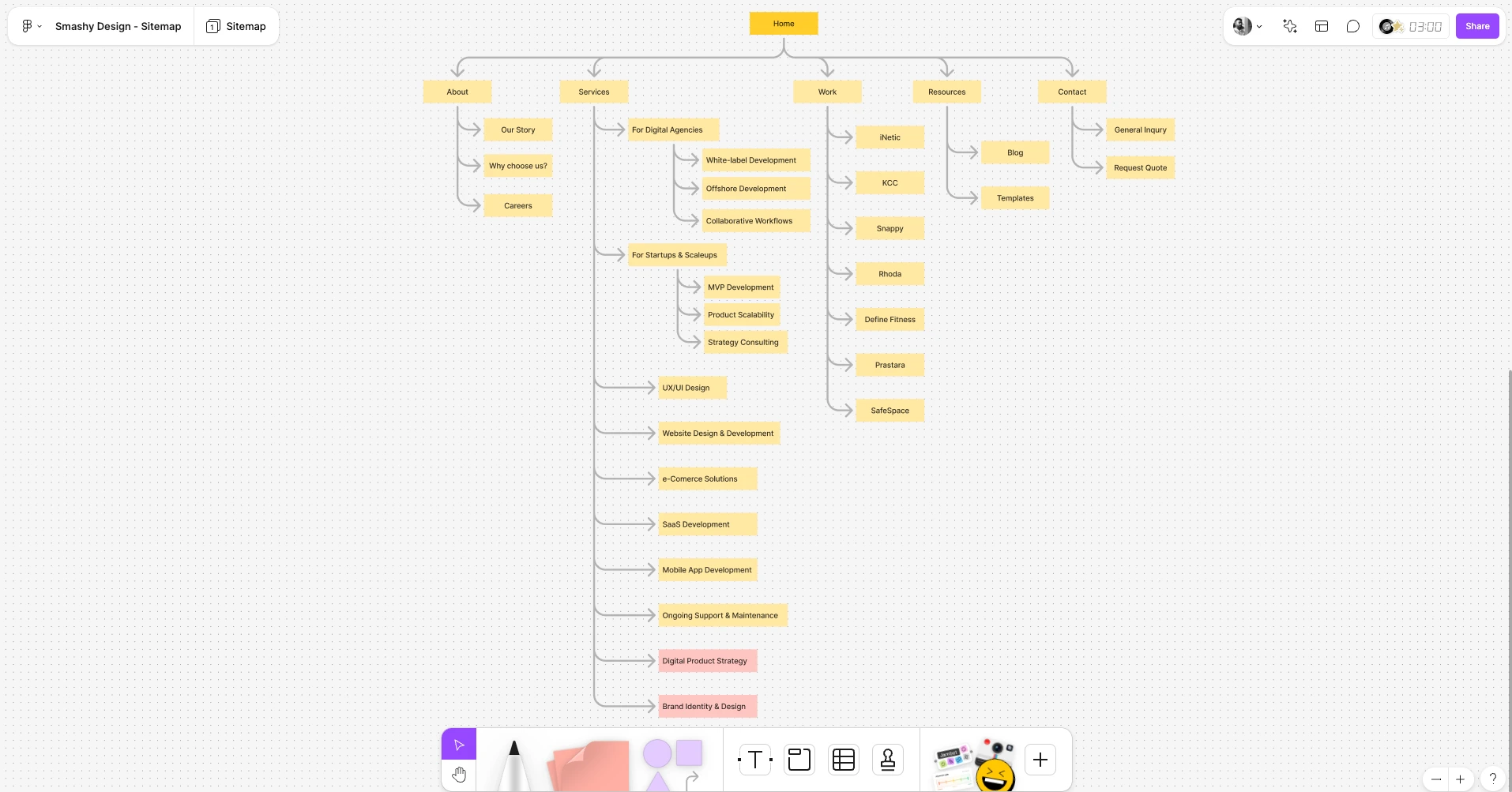
We began by creating a detailed sitemap and gathering inspiration from top award-winning websites. Our goal was to ensure a clean, elegant design that aligned with our core values and was easy to navigate.
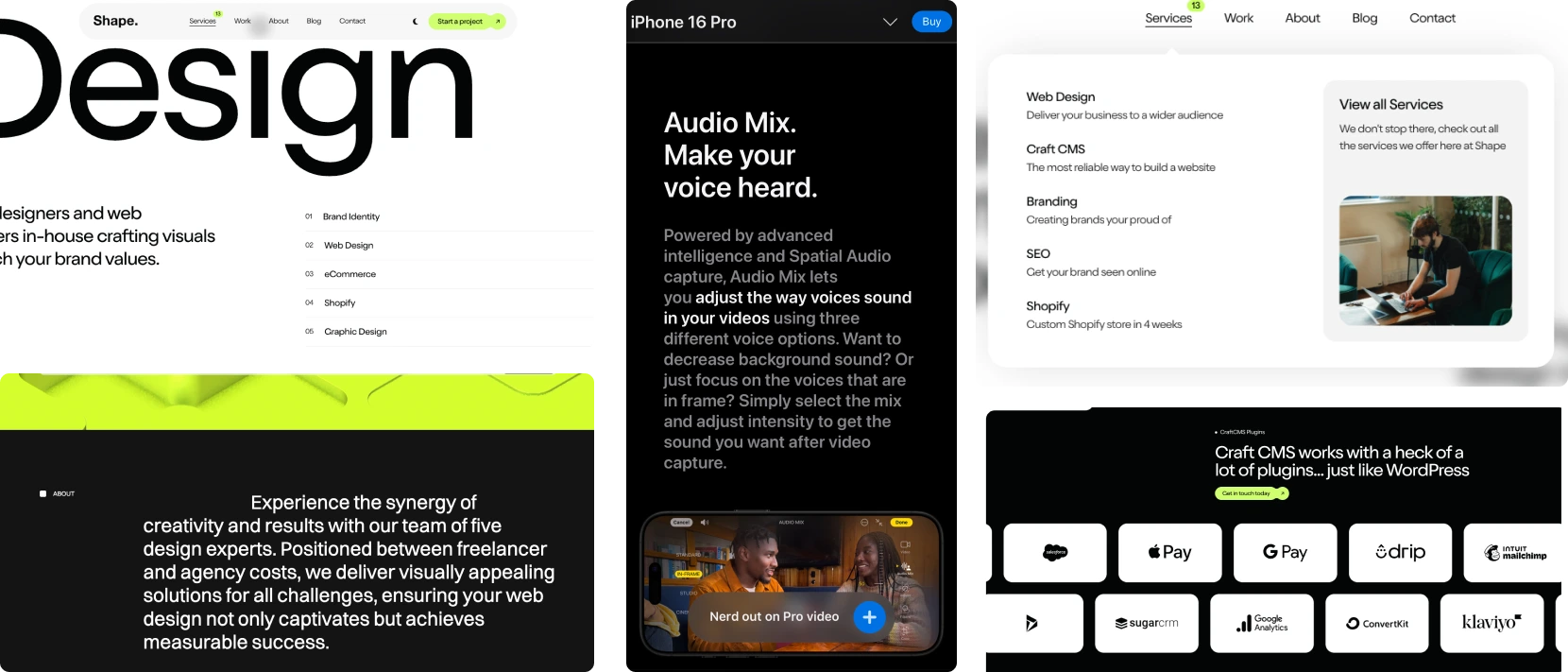
Inspiration from the Best
Our next step involved collecting ideas from award-winning websites, aiming to keep our style simple, clean, and elegant. Combining these inspirations, we crafted a design vision that reflected both our brand and current web trends.
However, our initial design was a bit too minimalistic, so we introduced subtle interactions to enhance engagement without compromising on speed.
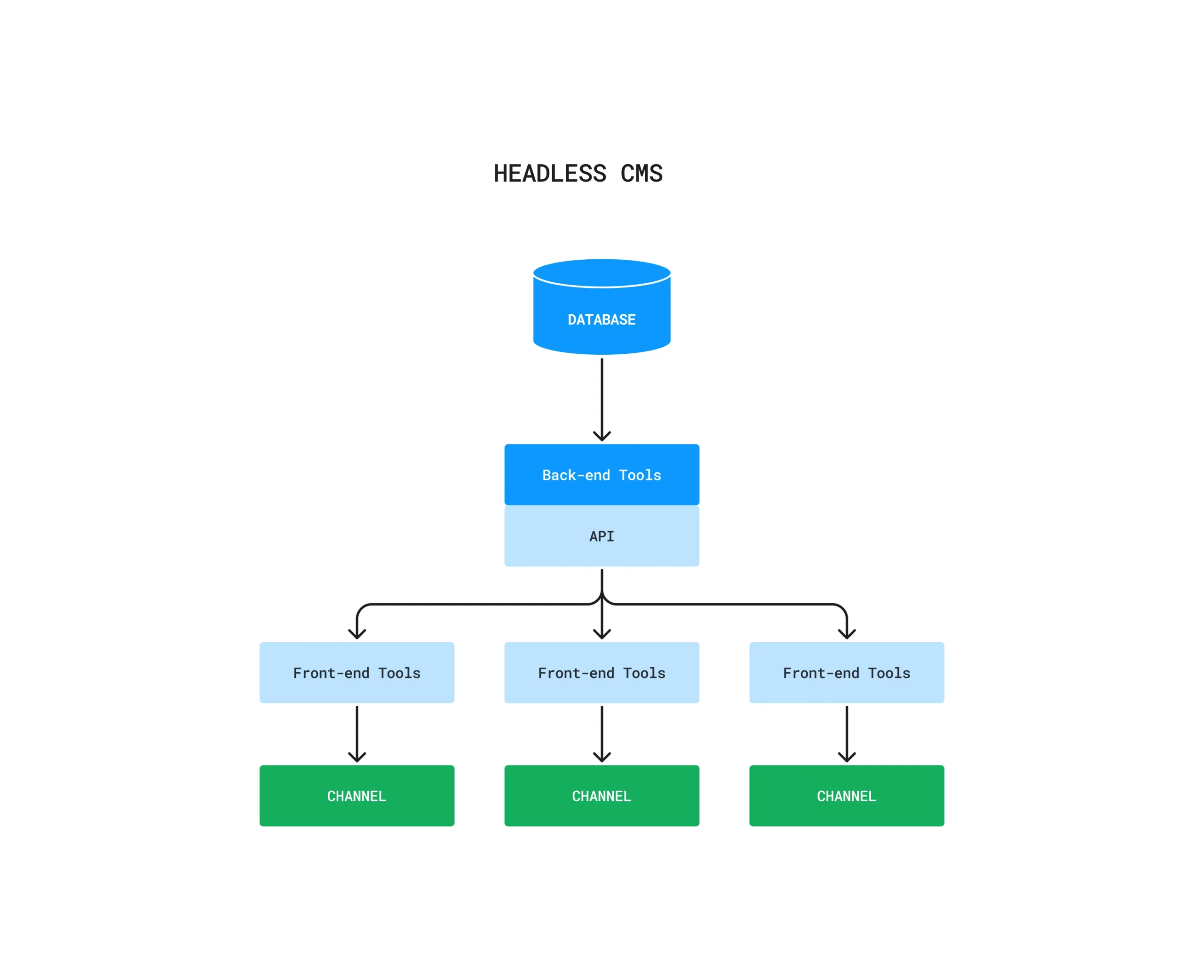
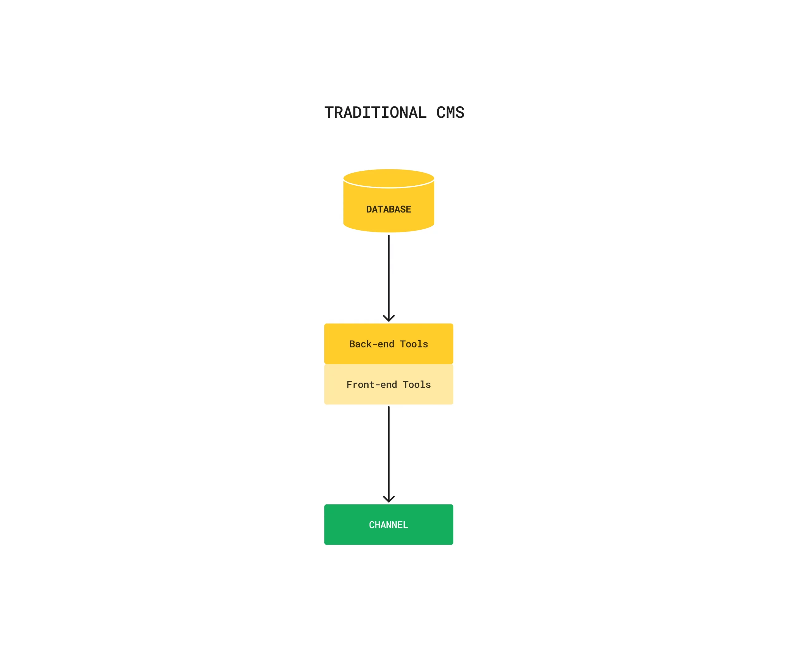
Deciding on Technology: Headless vs. WordPress
We considered building the site headless for optimal performance and flexibility, but with time constraints and ongoing client projects, we chose WordPress. This allowed for faster implementation while ensuring we had control over updates.
Iterations and Refinements
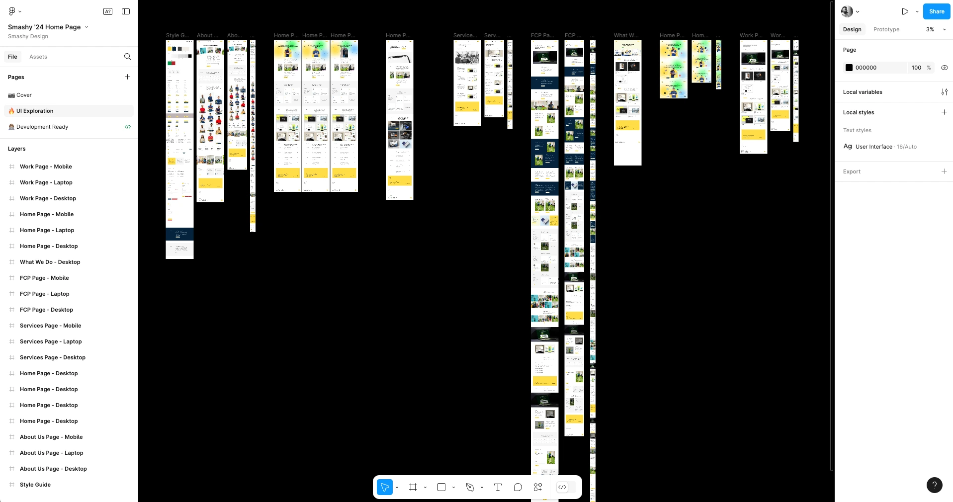
Unlike client projects, we were freer to make continuous tweaks, even late in development. This meant countless iterations and adjustments to achieve a balanced look and feel.
Huge shoutout to our developers, who patiently worked through these changes, making our evolving vision a reality.
The Results So Far
Since launch, we’ve seen a 245% increase in site traffic—a promising start! We’re receiving invaluable feedback from peers and the industry, which we’re continuously incorporating to enhance the experience.
Thanks for being part of our journey, and stay tuned for more insights as we further refine Smashy Design’s new digital home!